Color is the first thing people notice in any space — and in mosaic art, it’s the defining element. Before the eye registers pattern, material, or scale, it registers color. This isn’t just an aesthetic preference; it’s biological. The human brain processes color information 13 milliseconds faster than shape or text, triggering emotional and physiological responses before conscious thought kicks in. For architects, interior designers, and homeowners investing in custom mosaic installations, understanding color psychology transforms a decorative choice into a strategic design tool.
At BiliTiles, our handmade mosaic art collection spans over 200 color families across glass, ceramic, natural stone, and mixed-media compositions. Each color decision we guide clients through is rooted in both design principles and psychological science. Here’s what you need to know to make color work for your space.
The Science Behind Color Perception
Color psychology isn’t pseudoscience — it’s rooted in measurable physiological responses. Studies in environmental psychology demonstrate that specific wavelengths of light trigger distinct neurological reactions: warm colors (longer wavelengths, 620-750nm) stimulate the sympathetic nervous system, raising heart rate and alertness, while cool colors (shorter wavelengths, 450-495nm) activate the parasympathetic system, lowering blood pressure and promoting calm.
In mosaic art, this science matters because of surface area. A mosaic installation typically covers 10-100x more visible surface than framed wall art, meaning the color’s psychological impact is amplified proportionally. A 3m² glass mosaic backsplash in deep blue affects the room’s emotional atmosphere far more than a framed painting of the same color. This is why hotels, restaurants, and healthcare facilities increasingly specify mosaic color palettes based on intended guest experience rather than purely decorative considerations.
| Color Family | Psychological Effect | Best Mosaic Applications | Recommended Materials |
|---|---|---|---|
| Warm (Red, Orange, Yellow) | Stimulating, energizing, appetite-boosting | Restaurants, social spaces, entryways | Glass, glazed ceramic, gold-leaf smalti |
| Cool (Blue, Green, Purple) | Calming, restorative, focus-enhancing | Bedrooms, spas, bathrooms, offices | Glass, marble, turquoise stone |
| Neutral (White, Gray, Beige, Black) | Grounding, sophisticated, timeless | Lobbies, galleries, luxury retail | Natural stone, marble, matte ceramic |
Warm Colors: Energy, Appetite, and Social Connection
Red Mosaics for Energy and Appetite
Red is the most physiologically activating color in the spectrum. It increases heart rate, stimulates appetite, and commands attention — which is why restaurant chains from McDonald’s to fine-dining establishments use red strategically. In mosaic art, red glass tesserae or deep terracotta ceramic tiles create focal points that draw the eye and energize a room. However, red’s intensity requires careful dosing: a full wall of red mosaic can feel overwhelming. The most sophisticated applications use red as an accent — a border, a medallion inset, or a gradient that transitions from deep burgundy to softer earth tones.
Design tip: Pair red mosaic accents with warm neutrals (cream, sand, taupe) to ground the energy without diluting it. For commercial restaurants, a red mosaic bar front or counter surround performs double duty — stimulating appetite while concealing wear from high-traffic use.
Orange for Creativity and Social Spaces
Orange occupies a unique position between red’s intensity and yellow’s optimism. It’s associated with creativity, enthusiasm, and warmth without the aggressive edge of pure red. In hospitality design, orange mosaic features — particularly in hotel lobbies, co-working spaces, and creative studios — encourage social interaction and project a welcoming, unpretentious atmosphere. Glass mosaic in amber and tangerine tones catches natural light beautifully, creating what designers call “warmth without weight.”
At BiliTiles, our hand-cut orange glass mosaics are increasingly specified for boutique hotel accent walls and restaurant feature panels, where the color’s association with appetite and conviviality drives measurable increases in guest dwell time.
Yellow for Optimism and Natural Light
Yellow is the most visible color to the human eye and the strongest psychological trigger for happiness and optimism. In spaces with limited natural light — basement bathrooms, interior hallways, north-facing rooms — yellow mosaic installations can simulate the effect of sunlight, making spaces feel brighter and more expansive. Gold-leaf smalti mosaic, a specialty at BiliTiles, takes this effect further by reflecting actual light rather than just mimicking it. A gold mosaic bathroom accent wall can transform a windowless space from cave-like to luminous.
Design tip: Yellow works best when balanced with white or pale gray grout. Dark grout with yellow tile can create a harsh checkerboard effect that undermines the intended warmth.
Cool Colors: Calm, Focus, and Depth
Blue Mosaics for Tranquility and Spatial Expansion
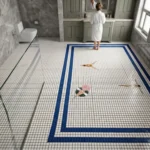
Blue consistently ranks as the world’s most universally liked color, and its psychological effects are well-documented: it lowers blood pressure, slows respiration, and enhances focus. Blue mosaic installations — from swimming pool waterlines to spa treatment rooms — create an immediate impression of cleanliness, depth, and serenity. Dark navy and midnight blue mosaics add drama without aggression, making them popular for luxury residential bathrooms and high-end hotel suites. Lighter aqua and sky-blue mosaics, on the other hand, visually expand small spaces — a critical consideration for compact urban bathrooms or powder rooms.
In pool mosaic design, blue is the natural default, but the shade matters enormously. Mediterranean-inspired turquoise evokes resort leisure, while deeper cobalt projects exclusivity and sophistication. BiliTiles’ glass mosaic catalog includes 47 distinct blue shades, each tested for underwater light refraction performance.
Green for Balance and Biophilic Connection
Green sits at the center of the visible spectrum, and human eyes process it with less strain than any other color — an evolutionary adaptation to our ancestral savanna environments. Green mosaic installations tap into biophilic design principles, creating a sense of connection to nature that measurably reduces stress and improves cognitive performance. In healthcare settings, green mosaic feature walls in waiting areas and patient rooms have been shown to reduce perceived wait times and lower patient anxiety scores.
Natural stone mosaics in verde marble, malachite, or serpentine offer an additional layer of authenticity — the organic veining and tonal variation in natural green stone cannot be replicated by manufactured materials, and the tactile quality of hand-cut stone adds a sensory dimension that glass alone cannot provide.
Purple for Luxury and Spirituality
Historically the most expensive pigment to produce (Tyrian purple required 12,000 murex snails to produce 1.4 grams of dye), purple retains its association with royalty, luxury, and spirituality. In contemporary mosaic art, purple and violet tones — especially in iridescent glass and amethyst-hued smalti — create an unmistakable impression of exclusivity. Boutique hotels and luxury residential projects frequently specify purple mosaic accents for master suites, meditation rooms, and powder rooms where the goal is drama and distinction rather than mass appeal.
Design tip: Purple mosaic works best as a deliberate statement, not a background color. Use it for a single feature wall, a vanity backsplash, or a decorative border. Paired with gold grout or gold-leaf accents, the luxury impression compounds exponentially.
Neutral Palettes: The Sophisticated Foundation
Not every mosaic installation calls for vibrant color. Neutral mosaics — white marble, gray limestone, beige travertine, black basalt — provide a timeless foundation that complements rather than competes with surrounding decor. The psychological effect of neutral mosaics is grounding and sophisticated: they communicate restraint, quality, and permanence. In luxury retail environments, neutral stone mosaic floors signal that the products, not the architecture, deserve attention. In residential settings, neutral mosaics provide design flexibility — the room’s color story can evolve around a permanent neutral mosaic installation without conflict.
Black deserves special mention: pure black mosaic, especially in matte-finish ceramic or honed basalt, creates dramatic negative space that makes adjacent colors appear more vivid. A black mosaic border around a colorful central medallion, for example, intensifies every hue inside it.
| Neutral Color | Psychological Effect | Best Pairing |
|---|---|---|
| White / Cream | Purity, spaciousness, cleanliness | Any color — universal backdrop |
| Gray | Balance, sophistication, calm | Blue, green, warm metallics |
| Beige / Taupe | Warmth, stability, approachability | Terracotta, olive, gold |
| Black | Drama, elegance, authority | Gold, white, jewel tones |
Color Combinations: The Psychology of Pairing
Single-color mosaics are powerful, but multi-color compositions unlock psychological effects that individual colors cannot achieve alone. The principles are well-established in color theory and validated by interior design outcomes:
Complementary pairs (opposite on the color wheel, e.g., blue + orange, purple + yellow) create maximum contrast and visual energy — ideal for retail storefronts, restaurant feature walls, and entertainment venues where dynamic atmosphere matters.
Analogous harmonies (adjacent on the color wheel, e.g., blue + green + teal) create a seamless, sophisticated flow — perfect for spa treatment rooms, hotel corridors, and residential bathrooms where tranquility is the goal.
Monochromatic gradients (variations of a single hue, e.g., pale sky blue through deep navy) add depth and movement without introducing competing colors — excellent for swimming pool waterlines, shower enclosures, and feature walls where the mosaic transitions across a surface.
Triadic balance (three evenly spaced colors, e.g., red + blue + yellow) is bold and requires expert execution. In custom mosaic art, triadic palettes work best when one color dominates (~60%), a second supports (~30%), and the third accents (~10%).
Room-by-Room Color Psychology Guide
Kitchen and Dining Areas
Warm colors dominate here for evolutionary reasons: red, orange, and warm yellows stimulate appetite and social interaction. A mosaic backsplash in warm terracotta, amber glass, or multicolor Mediterranean-style ceramic creates a gathering-friendly atmosphere. Avoid cool blues and greens in dining areas — they suppress appetite and can make food appear less appealing under artificial light.
Bathroom and Spa
Cool blues, soft greens, and spa-like aqua tones promote relaxation — the psychological effect you want for spaces dedicated to unwinding. White marble or neutral stone mosaics with subtle glass accents add luxury without overwhelming. For powder rooms where the goal is impact rather than relaxation, jewel tones (emerald, sapphire, amethyst) in small doses create memorable guest experiences.
Bedroom
Soft, muted palettes lower arousal and support sleep. Lavender, dusty blue, sage green, and warm gray mosaics in bedroom accent walls or headboard features promote calm. Avoid red and bright orange in sleeping spaces — they raise physiological arousal and can interfere with melatonin production.
Living Room and Social Spaces
Earth tones and balanced warm-neutrals create the most versatile backdrop. A natural stone mosaic fireplace surround in warm beige, cream, or subtle multicolor creates a natural gathering point. For open-plan living areas, use color transitions in the mosaic to visually zone different functional areas — warmer tones near the dining zone, cooler near the media area.
Commercial and Hospitality
Hotel lobbies benefit from warm welcoming tones (gold, amber, warm stone) balanced with sophisticated neutrals. Restaurant interiors perform best with appetite-stimulating warm palettes (see our hotel mosaic procurement guide for detailed hospitality strategies). Spa and wellness centers should prioritize cool, nature-inspired palettes. Retail spaces can be bolder — triadic color mosaics create memorable brand moments that encourage social media sharing.
Material Impact on Color Perception
The same color reads differently across mosaic materials, and this matters for psychological effect:
Glass mosaic: Color appears most vibrant and luminous. Light passes through and reflects off the backing, creating depth. Best for maximizing color’s psychological impact — blues appear deeper, reds more intense, gold more radiant. Iridescent glass adds an angle-dependent color shift that creates visual dynamism.
Ceramic mosaic: Color reads as more matte and grounded. Glazed ceramic offers a middle ground between glass vibrancy and stone subtlety. Best for warm palettes where you want energy without the high-gloss intensity of glass.
Natural stone mosaic: Color appears most organic and subdued. The natural veining in marble, the crystalline sparkle in granite, and the matte warmth of travertine add complexity that manufactured materials cannot replicate. Best for neutral and earth-tone palettes where subtlety and texture are more important than color intensity.
Metal and smalti: Gold, copper, brass, and silver tiles introduce reflective color that changes with viewing angle and ambient light. Metal accents amplify the luxury perception of any surrounding color palette. Gold smalti (hand-poured glass with real gold leaf) is the ultimate tool for creating perceived value — a single square foot of gold smalti mosaic can elevate an entire installation’s psychological price anchor.
Choosing Colors Based on Light Conditions
Natural and artificial light transform mosaic color perception at different times of day, and this temporal dimension is often overlooked in specification:
North-facing rooms receive cool, consistent light. Warm-toned mosaics (amber, coral, gold) compensate beautifully. Cool-toned mosaics in north-facing rooms can feel clinical or cold.
South-facing rooms (in the Northern Hemisphere) receive warm, changing light throughout the day. Cool blues and greens stay balanced, while warm colors can feel overwhelmingly hot in afternoon sun.
East-facing rooms are brightest in the morning with warm light shifting to neutral by afternoon. Multicolor mosaics with both warm and cool elements perform best.
West-facing rooms receive intense warm light in late afternoon/evening. Deep blues, purples, and cool greens counterbalance beautifully. Gold and warm earth tones in west-facing rooms glow dramatically during golden hour — a deliberate effect many designers exploit.
Artificial lighting temperature also matters: 2700K-3000K (warm white) enhances warm mosaic colors; 3500K-4000K (neutral white) renders all colors most accurately; 5000K+ (daylight/cool white) makes blues and greens pop but can wash out warm tones.
Custom Color Consultation at BiliTiles
Every mosaic project at BiliTiles begins with a color consultation. Our Foshan factory maintains a physical color library of 2,000+ glass, ceramic, and stone tile samples, and we produce custom color blends that match any specification — Pantone, RAL, or physical reference. For commercial projects, we provide color-accurate digital renderings showing how specified mosaic palettes will read under different lighting conditions throughout the day.
Contact us at info@bilitiles.com to schedule a color consultation, or visit our online catalog to explore our full mosaic color range.
Browse our color-rich mosaic collections:
- Glass Mosaic Buying Guide — explore 47+ blue shades, iridescent options, and metallic-fused glass
- Marble Mosaic Guide — natural stone color palettes from Carrara white to verde green
- Hotel Mosaic Procurement Guide — color strategies by hospitality zone
- Foshan Factory Guide — see our color library and custom blending capabilities
- Pool Mosaic Design Guide — color performance underwater